User Interface
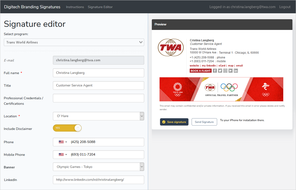
Our user interface is designed to minimize confusion or doubt on the user’s part, while maximizing the ability to create signatures that are brand-adherent and full-featured. We accomplish this by embedding all relevant information in simplified choices. In the example shown below, the user’s choice of “location” immediately auto-populates the address, the map link, and the address portion of the vCard. Other aspects of a signature’s content can be auto-populated based on a single user selection - for instance the display of the confidentiality statement in English, French or Spanish, depending on location, or the inclusion of specific licensing or registration language as required in certain countries.
