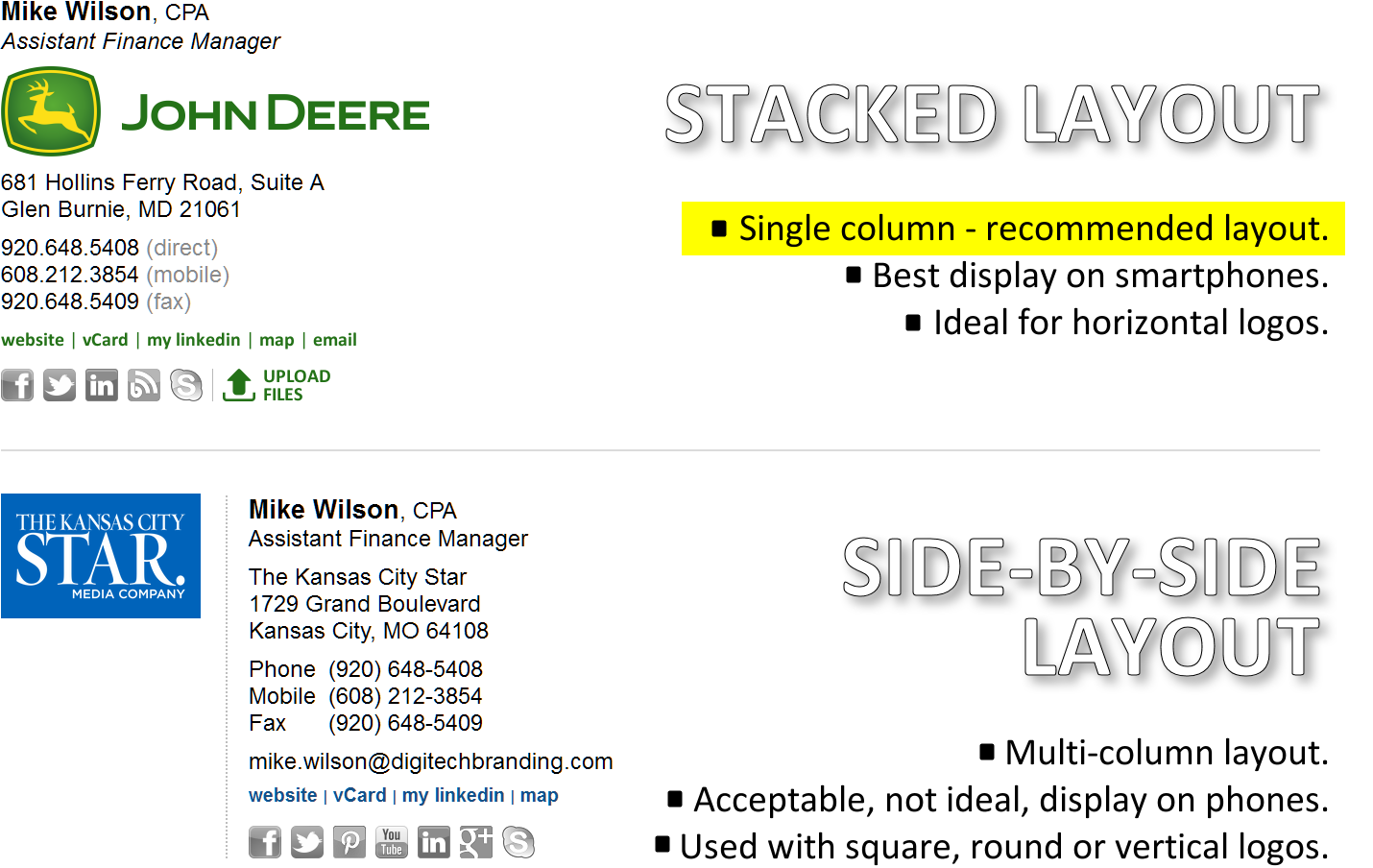
Original Email Signature Designs
Business email signatures typically consist of three primary components - key contact information, company logo, and one or more hyperlinks. Of these, it is generally the logo that drives the layout. Logos can be more-or-less horizontal, squarish / roundish, or vertical. We’ve developed two primary layouts that we generally employ, depending on the shape of the logo.

While we are willing and able to execute almost any design you have in mind, the sixteen years we’ve spent in designing email signatures has taught us to focus more than anything on the way the signatures actually perform in day-to-day use. Performance, that is, the way they display when someone receives an email message is the one true measure of success. If you had to quantify this measure of success, you’d want to look at:
- How frequently does your email signature appear perfectly?
- When it doesn’t appear perfectly, is all your contact information still readily available?
- Does your signature create readability problems on smartphones?
- When your signature degrades, does the degraded version render acceptably, or is it really a mess?
- Is the signature you are using as technically reliable as is possible?
Assessing the content requirements and arriving at the optimal layout is always the first step in a successful email signature program. Since 1999 we’ve created over 5000 custom email signature designs for diverse clients worldwide (view our gallery).