Designers face some unique challenges when it comes to the creation of email signatures. In this article I share my experience over fourteen years and thousands of email signature designs. Following is my insight into how email signatures fail, and more importantly, how to push past their shortcomings to a successful design.
A companion article - Creating, Installing & Using HTML Email Signatures - Technical Considerations - provides the technical detail needed to build upon the design concepts presented here.
Begin by Recalibrating Expectations
A great business email signature would:
- have visual pizzazz or classic styling;
- contain a wealth of pertinent information & hyperlinks without being overwhelming;
- while always functioning flawlessly.
Note that I said “would” and not “does.” Having dedicated myself to designing and developing email signatures for the past 14 years, I can state with authority that the above is not possible. With that out of the way, let’s start over.
A good business email signature is:
- visually appealing and reinforces branding;
- achieves a happy medium in terms of content & hyperlinks;
- functions as well as is possible and fails gracefully.
We’ve already made an important first step in the email signature design process - we’ve recalibrated expectations. Why is this necessary?
First of all, it just seems intuitive that creating a great email signature would be simple. Webpages can look beautiful and work flawlessly, even while incorporating complicated and diverse content. So an email signature, which is usually no more than contact information, a logo, and a few links, should pose no problem at all. Not true. We’ll come back to why shortly.
The second reason it’s necessary to begin by recalibrating expectations is that virtually everyone has received a beautifully designed email signature - an email signature that worked perfectly. Jumping to the (erroneous) conclusion that what they see is what everyone sees, this “perfect” email signature then sets the standard for the one they want for themselves.
Try our service - create your signature in 30 seconds!
Create your signature now
The Problem is Easily Explained
Webpages display reliably because the only thing between the point of origin (the HTML code) and the destination (the webpage) is a browser. Displaying the webpage is the browser’s primary job, so it facilitates this simple transaction between author and reader almost perfectly.
Email is technically identical to a webpage - that is, it’s simply some HTML code that gets translated (by an email “client” program, not a browser) into something a person can read.
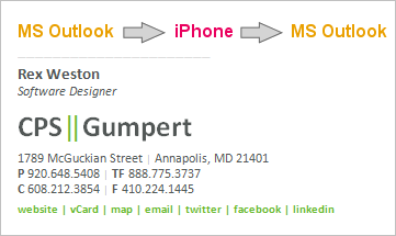
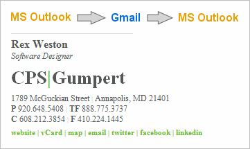
However, its “life” is frequently much more complicated than that of a webpage. It begins simply enough, the user composing a message using their email program (Outlook, iPhone, Gmail, etc.). The formatting of an email message, and signature, almost always starts out perfect. The next step though, is that it’s received by someone who:
- may be using a computer or may be using a phone;
- may receive email in Outlook, Gmail, iOS, Android, Yahoo, BlackBerry or something else;
- may have image blocking turned on (and if so, may or may not choose to display the images);
- may convert all received email into plain text.
They then may reply or forward. In so doing, the settings and capabilities of whatever email program / device they are using apply to the whole message, not just to the new content they’ve added. The whole message includes the original email signature. Depending upon the combination of the above listed factors, the email signature may survive intact or may degrade (fail) in various ways. The following chart shows some of the most common situations:
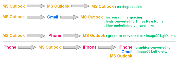
Understanding that failure will occur along these lines is key to the next step in effective email signature design, the compromise.

The Compromise
Given that email signatures do not work as well as we’d like, we need to settle for something less than perfect. The spectrum of choices ranges from brief text to graphically rich signatures loaded with hyperlinks. As is true of most things in life, a happy medium lies somewhere in- between.
As I’ve observed over the years, when the proper happy-medium is achieved, users settle in comfortably. Identifying where on the spectrum this happy-medium lies takes experience, good honest communications with the customer, and occasionally some trial and error.

As a rule-of-thumb, professionals (attorneys, CPA’s, engineers, etc.) tend left of center of the spectrum shown above, while sales people (real estate, mortgage lenders, insurance), tend further to the right.
There is no right or wrong. With the signature on the left, Emily will experience a high degree of reliability. Almost every time she sees her signature, including in email threads that have gone back and forth a bunch of times, her signature’s going to look about the same. Any anxiety Emily feels in regards to her signature is likely to come when she is exposed to a full-featured, graphically rich, signature and is left to wonder if she’s missing something.
On the other hand, if Emily’s using the signature on the right, she’s likely to frequently see this:

This experience can create the opposite type of anxiety - leaving her wondering if maybe she hasn’t gotten too fancy and is now creating an unprofessional impression.
Over the years I’ve created all types of signatures for people, helped people move back and forth across this spectrum, and watched as they finally get settled and comfortable with a signature that is always a bit less than perfect.
Note: For a person like Emily, using the signature shown above with all of the ‘s, it’s critical for her to understand that the person she emailed most likely saw the signature as intended. Only when that person clicked REPLY did things get messed up. This is the truth, and is also a very important point in helping new users get comfortable with the performance of their signatures.
Try our service - create your signature in 30 seconds!
Create your signature now
Achieving the Compromise - Your Toolkit
Because of the likelihood that the user (your customer) will not have an in-depth grasp of the issues surrounding the use of their email signature, one of your jobs as a designer is to guide them down the most prudent path during the design phase. Where they may see nothing but colorful images, precision alignment, and numerous hyperlinks, you may be seeing ahead to the pending headache of explaining to them why it’s not working exactly as they wanted it to.
From a reliability standpoint, your primary enemy is graphics. Lesser enemies are hyperlinks and text strings that can wrap badly.
Dialing back on the use of graphics can, at times, be accomplished with minimal impact on the visual quality of the signature. Here’s a recent situation I dealt with. The full design the client specified was:
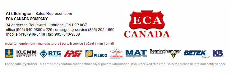
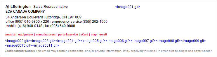
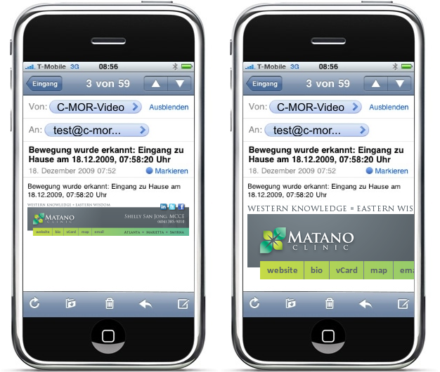
Each of the little logos in the row at the bottom was individually hyperlinked, all going to a specific manufacturer page on the ECA website. When this email signature traveled from MS Outlook to iPhones and back, the result was:
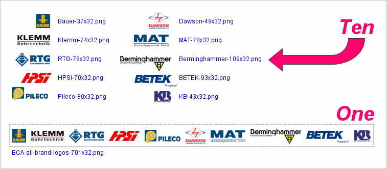
Responding to the customer concern, I improved this by grouping the ten logo graphics into one graphic:
Following this improvement, the resulting degraded signature appeared as:
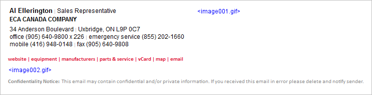
As you can see, the failure above is more gracefully presented than the one with eleven ‘s. In this case I was able to link to a manufacturer’s page which was a jumping off point for all ten of the individual manufacturers, so we lost nothing visually and very little functionally, making this a good step towards the happy medium for this user.
To illustrate a different approach, let’s return to the Recruiters International signature for Emily Fitzpatrick. As you recall, she had eight social media (type) icons at the bottom of her signature:

As a result of all the graphics (logo and many icons), her signature looked as follows after making the roundtrip from Outlook through an iPhone and back:
In this case, we were able to clean it up significantly by changing the icons to text. The look of the intact signature then became:

As a result of this adjustment, her signature now looked as follows after making the roundtrip from Outlook through an iPhone and back:

Now, this may or may not have been the happy medium for Emily - it really depends upon how wedded she was to those social media icons. At least I was able to offer her options, allowing her to be the final arbiter.
Try our service - create your signature in 30 seconds!
Create your signature now
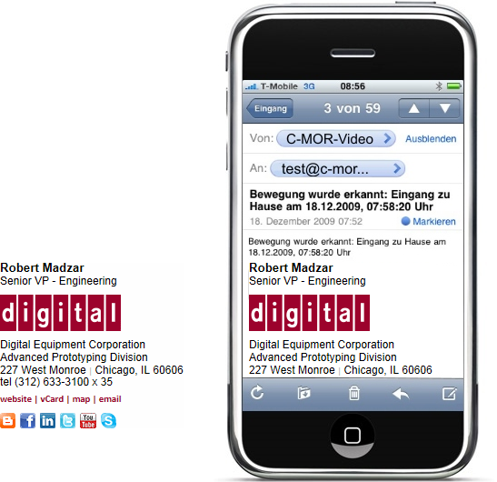
Next let’s take this drive towards greater reliability a step further. Sometimes it’s possible to create a good reproduction of a company’s logo by using stylized HTML text. Here’s an example of a signature I designed recently that had four graphics - the company logo and three social media icons:
![]()
After this was put in use, the customer indicated that a few users were experiencing a considerable degree of consternation over the behavior of the graphics, and would it be possible to reconstruct the signature with no graphics at all. The resulting text-only signature was:

At this point we have a signature that is going to present minimal changes as it travels from email program to email program.
Back-and-forth between MS Outlook and iPhone / iPad results in no degradation.
Gmail changes the font styling to Times New Roman and collapses the two vertical green bars into one.
Note on Line Spacing (Leading): Many normal HTML styling tricks are unavailable to you when designing email signatures. One of these is an ability to reliably create reduced line heights. As a result, a reliable text-based recreation of a stacked logo that utilizes tight leading is not possible.

In this section I’ve covered the process of stepping backwards across the performance / design spectrum. Understanding the tools that are at your disposal, and the gains and sacrifices made by various choices, puts you in a better position to commence the design phase of your project - the goal being to present the customer with a design that satisfies them when first seen, and then continues to satisfy them when in actual use.
Forward Looking Design & Layout
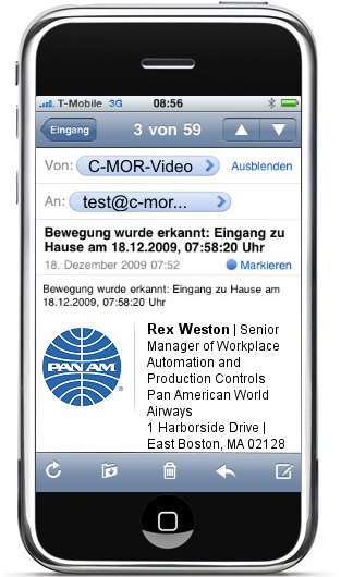
One trap that’s important to avoid is the creation of a design that cannot handle abnormally long strings of text. This is most common when it comes to titles. You may anticipate a title such as “Vice President of Administration” but not be prepared for “Senior Manager of Workplace Automation and Production Controls”. The graphic below is an illustration of a design concept that could suffer from this problem.
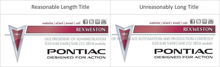
Sometimes the most practical solution is to deal with the handful of anomalies (long names or titles) on a custom basis, in the case above perhaps manually widening the design in the few cases where it’s necessary.
Smartphones present the greatest design problems these days. First and foremost is text wrapping. A linear presentation of phone numbers and addresses is often preferable from a design standpoint:
1800 East Washington Avenue, New Lisbon, WI 53303 Tel: (608) 233-3100 | Mobile: (608) 845-8333 | Fax: (608) 233-3199
However, the wrapping on a smartphone may cause this to be displayed as:
1800 East Washington Avenue, New Lisbon, WI 53303 Tel: (608) 233-3100 | Mobile: (608) 845-8333 | Fax: (608) 233-3199
It’s useful to note that expectations seem to be low for the display of email signature on smartphones - most people recognize that the screens are small with the result being that perfect formatting may suffer. However, if the above wrapping proves to be unacceptable to the customer, the obvious solution is to move to a stacked design:
1800 East Washington Avenue New Lisbon, WI 53303 Tel: (608) 233-3100 Mobile: (608) 845-8333 Fax: (608) 233-3199
Try our service - create your signature in 30 seconds!
Create your signature now
It is also important to think about the width of any graphics you may use, and if overly wide, how they may translate to display on a smartphone. Below is a graphically based signature design I did for a customer a number of years ago.

There are two ways, both bad, that this may be displayed on a smartphone. As seen on the left below, it can be scaled down to fit the window. In this case, the text in the signature becomes completely unreadable, making it impossible to even read the sender’s name. (I have seen cases where the message text itself is also shrunk at the same proportion as the signature graphic, making the entire message unreadable). The illustration on the right shows the alternative condition - the signature graphic is displayed full size, cutting off the vast majority of it.
In designing email signatures these days we must assume that they will be received on smartphones. As a result it is important to do your best to keep graphics to a reasonable width (a 300px maximum is a good rule-of-thumb).
It’s also important to remember how table layouts can limit available display space on smartphones. From a design standpoint, I tend to favor what I call a “side-by-side” design when confronted with a square, round, or vertically oriented logo. Here’s an example:
Note, however, the problem we encounter when displaying this on a smartphone:
As you can see, design becomes quite difficult when considering the various constraints. The optimal layout is a simple stacked design, with nothing wide enough to trigger wrapping on a smartphone. The simple email signature below on the left will produce the result shown on the right when displayed on a smartphone:
Although this can feel very limiting, I’ve found that it’s almost always possible to find a compromise design that the customer is comfortable with. Sometimes, unfortunately, this is a multi-step process, as it’s often the case that customers only become truly aware of the technical limitations once they put their email signature into actual day-to-day use.
Content Considerations
There’s a great deal that’s been written about what content belongs in an email signature, and what doesn’t. Although I’ve designed literally thousands of signatures, I don’t have a strong opinion as to what should be included - I think that the content decision is very customer specific. That said, here are a few experience-based observations:
Photos: Realtors & Mortgage Loan Officers often like photos of themselves:

Links to Bio Pages: Whenever bio pages for individuals are included on a website - attorneys almost always - then the email signature should include a hyperlink to the bio page. Email signatures provide a natural feeder into the more detailed bio page, allowing the sender to feel confident that he or she is sharing information about themselves in an effective and efficient manner.
Taglines: In some cases the addition of a company tagline is desired - I usually add them at the bottom of the signature, using a colored font if appropriate, such as I did here with the “We Build Trust, Teams & Integrity”

Page-Specific Hyperlinks: Some customers have very specific items on their website that they want to call people’s attention to. If this is the case, it may be appropriate to add these as page-specific links in the email signature itself, as we did here with “see a demo”, “buyer’s guide” and resource center”.

User Optional Content: One of the things that can make email signature design a challenge is the variations between users. Some may want to include their mobile phone number, some may prefer not to use their title, some may work out of a home office and hence not want to include a physical address, etc. Furthermore, email signatures are quite personal. The more latitude you give to users to customize their signature (within set boundaries) the more likely your program roll-out and adoption process will go smoothly. I often make social media links optional, always make mobile phone numbers optional, and sometimes make other data elements like a toll free number, a tagline, or page-specific hyperlinks optional.
Try our service - create your signature in 30 seconds!
Create your signature now
Conclusion
Here’s how I approach virtually every new email signature project:
- Present the customer with a middle-of-the-road design that I feel confident will work well.
- At the same time I present this to them I inform them that it will not work perfectly, and let them know about some of the problems they can expect. I usually do this by directing them to our FAQ’s. My feeling is that three things are accomplished by the simultaneous presentation of a design and its technical pitfalls - you nip their desire for something even fancier and more elaborate in the bud, you begin lowering their expectations to a reasonable level, and you establish yourself as someone who is going to be honest and straight-forward with them.
- If they don’t abandon the project (or you) at this point, you’re now in a good position to work with them and achieve a good result based on realistic expectations.
The companion article I’ve written, “Creating, Installing & Using HTML Email Signatures - Technical Considerations” will give you the detailed information you need in order to construct sound HTML code for an email signature, and then some helpful strategies for deploying the finished program. This article can be found here.
Good luck - there’s a lot of satisfaction in doing an email signature project well.
Let us show you what we can do for you!
Complete the form below to request a free, no-obligation, sample email signature program customized for your firm.
Have Questions? Need help?
Send us an email.
sales@digitechbranding.com